How to Make a High-Converting Sales Page in Minutes with Showit
January 28, 2024
Introduction
A sales page is a webpage designed to convert visitors into buyers or leads. The goal is to persuade visitors to take a desired action, like purchasing a product, signing up for a free trial, or requesting a quote. Sales pages use copy, design, calls-to-action, and other elements to guide visitors through the sales process.
Showit templates make it easy to create custom sales pages without any coding knowledge. Showit has beautiful templates designed specifically for selling products, services, online courses, and more. The templates handle all the technical work, so you can focus on writing compelling sales copy and customizing the design.
Some key benefits of using Showit templates for sales pages:
- Professionally designed templates created by designers. This saves time and gives a polished look.
- Mobile responsive design. Templates work seamlessly on all devices.
- Easy third-party integrations with payment processors, email services, and CRMs. Collect payments, capture leads, and integrate with marketing tools.
- Customizable layouts, fonts, colors, and images. Make the template match your brand.
- Drag and drop editor. Easily add/edit/remove content blocks.
- No coding required. The templates handle all the technical aspects behind the scenes.
- SEO optimized foundations. On-page SEO elements help pages rank high in search.
With a Showit templates, you can create a professional, high-converting sales page tailored to your business quickly and easily. So let’s dive in how to create high-converting sales page for your business.
Step 1: Picking a Showit Template
When creating your own sales page with Showit, the first step is picking the right template. Showit offers a wide variety of professionally designed templates specifically for sales pages.
Pay attention to these when choose Sales page template:
- Design. Should be the closest to your branding. If layout is similar to your site style and branding it will speed up the customization process.
- Right structure. Sales page should be built with the marketing in mind and should be optimized for conversions. Page should contain all elements in the best order to convert viewers into buyers.
- Pricing. I do believe Sales pages should more affordable compared to full website templates.

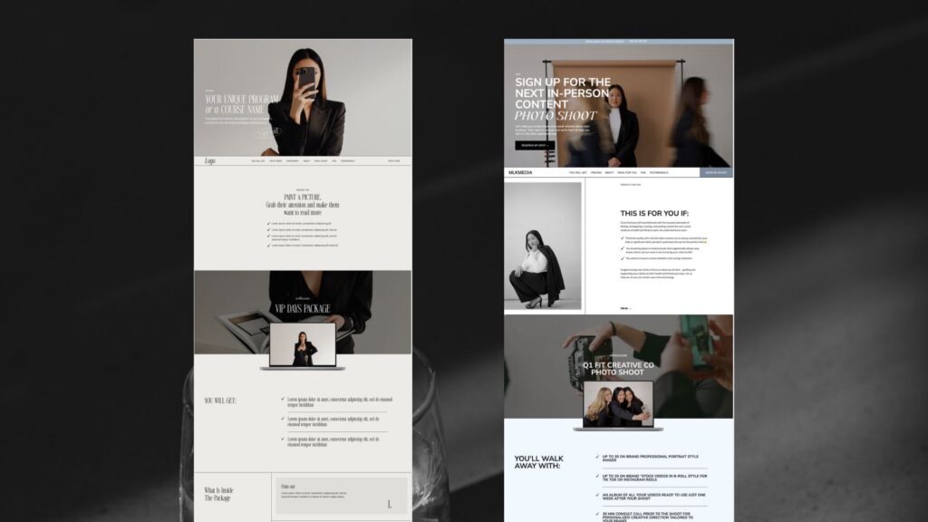
In Digital&Chic shop we have 3 Sales pages:
All the templates have these features:
- emotional header, review sections, Clear Call To Action, Compelling Value Proposition, FAQ and other customizable sections to boost conversions.
- mobile responsive
- SEO friendly
The key is to pick a template that aligns with your brand style and allows you to effectively display your most important information. Browse the template options and pay attention to layout, formatting, imagery, and calls-to-action placement. Then customize it further to create the perfect sales page.
Step 2. Customizing the Template
One of the best things about using a Showit template is how flexible and customizable they are. You have a wide range of options to make the template distinctly yours, from colors and fonts to overall layout and structure. This allows you to match the sales page design to your brand and style.
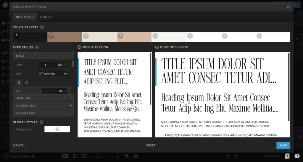
When you first open up a Showit template, take time to explore all the customization settings available. You’ll find them in the left sidebar menu. Here you can tweak colors, fonts, spacing, borders, backgrounds, and more.

For example, the default template colors might be blue and grey. But your brand uses green and beige. No problem! Just open up the color settings and update the primary, secondary, and accent colors to match your brand palette.
The same goes for fonts. Showit templates come with standard web fonts by default. You can change this to your brand fonts if desired. Just input the name of your chosen Google Fonts and the template will update automatically.
Beyond colors and fonts, you have control over layout too. Adjust column width, add spacing between elements, increase padding, and more based on what looks best to you.
Don’t be afraid to experiment with all the options! Start with the default template, then iteratively customize it until you have a design you love.
Here is a before and after example:

As you can see, the overall feel and look completely changes when applying custom branding and styles. This helps your sales page visually reinforce your brand identity and creates a more cohesive experience for visitors.
Take the time to thoroughly customize the template. Don’t just accept the default settings. Tweaking all aspects to match your brand is key for an effective and optimized sales page.
Step 3. Add Compelling Content
The written content on your sales page plays a critical role in persuading visitors to become customers. Unlike a standard website where the goal is to inform, a sales page is specifically designed to sell.
When crafting your sales page copy, keep these tips in mind:
- Focus on your customer, not yourself. Address their pain points and explain how your offer solves their problems.
- Use simple, clear language. Avoid overly complex words and industry jargon. Write conversationally, like you’re speaking one-on-one with the reader.
- Tell a story. Stories are memorable and help customers see themselves in your content.
- Speak to benefits, not just features. Don’t simply describe what your offer is, explain how it will tangibly improve your customer’s life.
- Use power words that evoke emotion. Words like “Results,” “Guarantee,” “Proven,” and “Finally” help create a sense of urgency and excitement.
- Build scarcity and social proof. Let customers know there’s limited availability or high demand to prompt quick action. Feature testimonials to reassure readers.
- Make a clear CTA. Every section should build toward a desired action, like clicking a link or button to purchase. Don’t leave readers guessing what to do next.
With compelling copy focused on your customers’ needs, you can craft a sales page that persuades visitors to become buyers.
Step 3. Optimizing the structure for Conversions tips
Once your sales page is live, the work isn’t over. You’ll want to continuously optimize your page to improve conversions over time. Here are some tips:
- Opening headline. Your headline and opening paragraph are critical for grabbing attention and convincing visitors to keep reading. Try different variations and see which ones result in higher conversion rates.
- Paint a picture. Paint a picture of life before and after using your product or service.
- Introduce your program.
- Tell visitors what they get if they’re buy your course or program.
- What is inside of a package
- CTA. Make your CTA buttons prominent with high contrast colors that stand out on the page. This draws attention to the calls-to-action.
- Introduce yourself. Build the trust with the visitors and showcase your experience
- Ideal client or buyer. Describe your ideal customer and why this program is for THEM.
- FAQ. Improve your customer’s experience. Provide quick information to help customers make a purchasing decision. It’s also can be good for SEO.
- Testimonials. Testimonials play an important role in building trust and social proof for your product or service. When potential customers see positive reviews and stories from past clients, it gives them the confidence to take the leap and make a purchase.
- Use urgency triggers Creating a sense of scarcity or urgency can increase conversions. Try adding countdown timers or notices about limited inventory
Step 4. Last touch
Once you have completed the customization, content creation, and structure of your Showit Sales page, it’s important to ensure that everything is in place before launching. This involves checking a few key elements to guarantee a smooth and successful launch.

Check if:
- buttons are working
- mobile is responsive and optimized
- misspelling
- you added SEO description to every picture
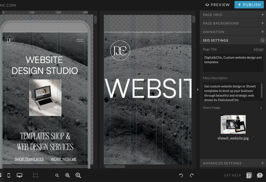
- SEO settings for page is filled
- all links are working well
By following these steps, you can ensure that your Showit Sales page is fully prepared for launch with functioning buttons, responsive design, error-free content, and compelling social proof elements. This attention to detail will contribute towards creating a professional and persuasive online sales presence for your business.
Conclusion
Creating your own sales page with a Showit template is a great way to showcase your offer and convert more leads into customers. Recapping the key steps we covered:
- Start by picking an eye-catching template that aligns with your brand and offer. Showit has beautiful templates for all types of businesses.
- Customize the template by adding your own colors, fonts, and images. This allows you to put your unique stamp on the page.
- Craft compelling headers using emotional hooks that capture attention. Outline the value your offer provides.
- Fill the page with persuasive content focused on addressing pain points and showing why your solution is the best.
- Insert prominent calls-to-action so visitors know what you want them to do. Make these action-driven buttons hard to resist clicking.
- Back up your claims with social proof like testimonials from satisfied customers. This provides credibility.
- Optimize the page for conversions by highlighting scarcity and urgency when appropriate. Remove friction and distractions.
With this strategic sales page, you’ll be well on your way to generating more leads and customers for your business. Don’t be afraid to test variations and constantly improve the page over time. Small tweaks can lead to big differences in conversion rates.
Additional resources:
10 Things to do before launching your website
Free Showit FAQ section template


exlpore mroe
Resources
take a look
Find a collection of my favorite tools, resources, and products for your business! From free Showit templates to websites tips. Explore and enjoy!
templates shop
shop templates
Easy to use Showit website templates are the perfect option if you are on a tight budget, on a short timeline, or want to customize a website on your own
work with me
work 1:1
With our website design template customization service, you can have a stunning and fully personalized website without the hassle of doing it yourself.