


A Guide to Choosing Fonts for Your Brand and Website
April 29, 2024
Fonts play a crucial role in shaping the identity and perception of your brand and website. The right font can convey your brand’s personality, values, and message effectively, while the wrong one can confuse or deter your audience.
There are different types of fonts and font pairings. I’ll also share where it’s better to find free and paid fonts. And if you’re wondering what the better font sizes for a website are and how to make it more readable, I’m going to answer that question too.
Below are some essential tips to help you choose fonts that resonate with your brand and enhance your website’s visual appeal.
Understand Your Brand Identity
Before delving into font selection, it’s vital to have a clear understanding of your brand identity. Consider the values, personality traits, and target audience of your brand. Is it modern and innovative, or traditional and trustworthy? Understanding these aspects will guide your font choices.
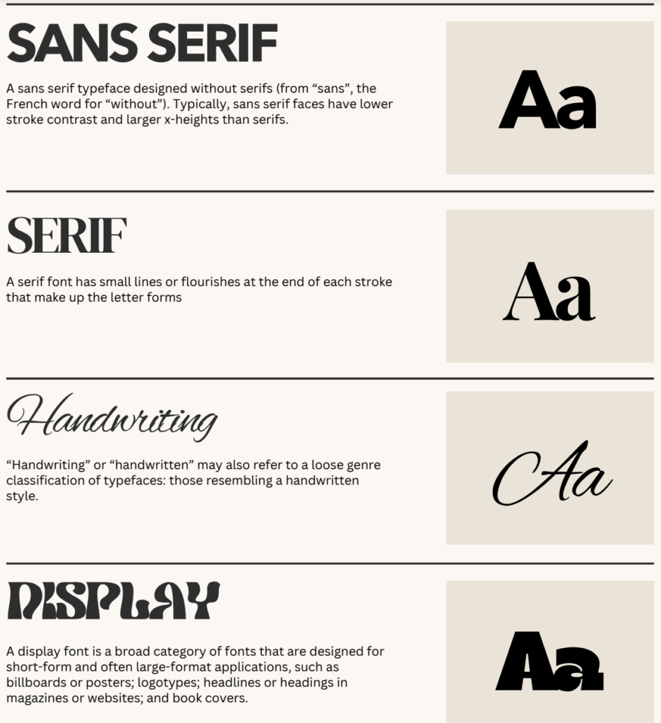
For example, serif fonts are often associated with a more elegant and traditional appearance. They also give off a sense of luxury and editorial feeling. On the other hand, bold grotesque fonts can indeed evoke a more brutal or rugged aesthetic. So, depending on the font choice, the message conveyed can vary.
Choose Fonts That Reflect Your Brand
Fonts have personalities too. Select fonts that align with your brand’s character. For instance, if your brand is sophisticated and elegant, serif fonts like Times New Roman or Garamond might be suitable. If it’s modern and playful, sans-serif fonts like Helvetica or Futura could be more fitting.
understanding the difference between serif and sans-serif fonts is fundamental in choosing the right typography for your brand and website.
Serif Fonts:
- Characteristics: Serif fonts are characterized by small decorative strokes, known as serifs, that extend from the ends of the letterforms. These serifs can be short, long, thick, or thin, depending on the font style.
- Appearance: Serif fonts often have a more traditional, formal appearance. The serifs create a sense of elegance and sophistication, making them suitable for conveying authority and trustworthiness.
- Readability: The serifs help guide the reader’s eye along the text, making serif fonts particularly suited for lengthy passages of text, such as books, newspapers, and articles.
- Examples: Times New Roman, Georgia, Garamond, Baskerville.
Sans-serif Fonts:
- Characteristics: Sans-serif fonts, as the name suggests, do not have serifs. They feature clean, simple letterforms without any additional embellishments.
- Appearance: Sans-serif fonts are often perceived as modern, clean, and minimalistic. The absence of serifs gives them a more straightforward and streamlined appearance, making them suitable for contemporary designs.
- Readability: Sans-serif fonts are generally considered more readable on screens, especially at smaller sizes, due to their clean and uncluttered appearance. They are commonly used for headings, labels, and digital interfaces.
- Examples: Helvetica, Arial, Futura, Roboto.
Key Differences:
- Presence of Serifs: The primary distinction between serif and sans-serif fonts lies in the presence or absence of serifs. Serif fonts have decorative strokes, while sans-serif fonts do not.
- Style and Tone: Serif fonts often convey a more traditional and formal tone, whereas sans-serif fonts tend to appear modern and informal.
- Readability: Serif fonts are generally preferred for printed materials and lengthy passages of text, while sans-serif fonts are commonly used for digital interfaces and short, attention-grabbing text.
- Usage: While both serif and sans-serif fonts have their place in design, their suitability depends on the context and intended message. Serif fonts may be preferred for traditional or academic content, while sans-serif fonts may be more appropriate for contemporary or tech-related topics.
Understanding these differences will help you make informed decisions when choosing fonts for your brand and website, ensuring that your typography aligns with your desired aesthetic and effectively communicates your message to your audience.
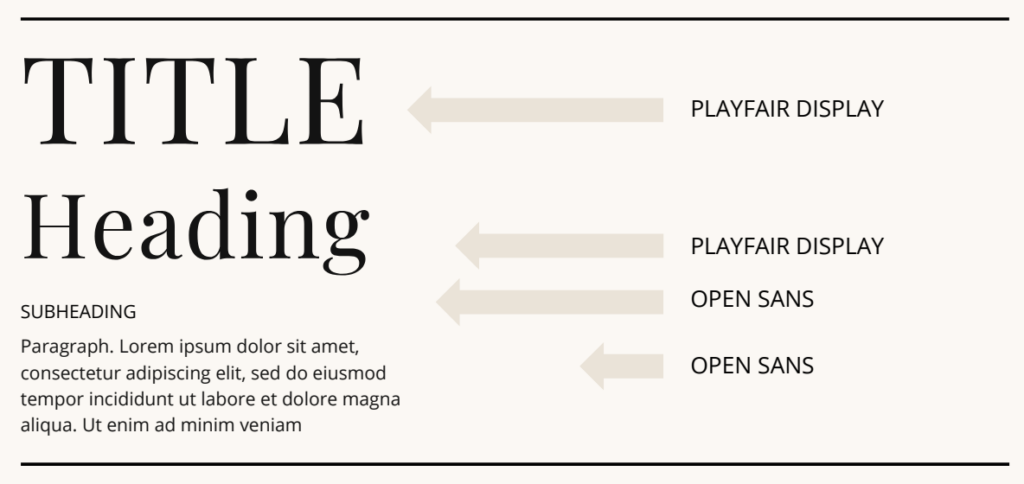
Okay, after we figure out the font typeface, here are some examples of font pairs:
- Playfair Display + Lato
- Cormorant Garamond + Montserrat
- Roboto + Open Sans
- Anton + Open Sans
- Higuen Elegant Serif + Future
and more on picture below
By the way, my favorite free or Google serif fonts include Playfair Display, Noto Serif Display, and Cormorant Garamond. As for sans-serif options, I highly recommend Helvetica Neue, Raleway, Lato, Open Sans, Poppins, Noto Sans, Montserrat, and Roboto.
Where to find fonts
There are tons of free and paid fonts available. Google Fonts is a popular source for free fonts. I also like Fontesk. For paid options, you can check out Creative Market, Creative Fabrica, and Etsy.
For those seeking unique and custom-made fonts, Behance serves as a treasure trove where designers occasionally share their original creations with the community. It’s a fantastic resource for discovering one-of-a-kind typefaces that add a distinctive touch to your designs.
Whether you’re on the lookout for free or paid fonts, exploring these diverse platforms opens up a world of possibilities, allowing you to find the perfect typefaces to enhance your design projects.
Fonts on website. What you need to know
Fonts are essential elements of design. Typically, it’s sufficient to have 2-3 fonts for one website. You can use different types of fonts for headings, subheadings, and paragraphs. However, it’s advisable to avoid using Serif fonts for paragraphs.
Font sizes could be various, depending on type of font.
- For paragraphs, the optimal font size is around 14-18px.
- For headings and titles, start at 30px and go larger.
- For subheadings, start from 12px and go bigger, but not larger than the heading.
Conclusion
Choosing fonts for your brand and website is more than just picking what looks good. It’s about conveying your brand’s identity, ensuring readability, and creating a memorable user experience. By following these guidelines and considering your brand’s unique characteristics, you can select fonts that strengthen your brand identity and resonate with your audience effectively.
More about planning your website see in this FREE WORKBOOK


exlpore mroe
Resources
take a look
Find a collection of my favorite tools, resources, and products for your business! From free Showit templates to websites tips. Explore and enjoy!
")
templates shop
shop templates
Easy to use Showit website templates are the perfect option if you are on a tight budget, on a short timeline, or want to customize a website on your own

work with me
work 1:1
With our website design template customization service, you can have a stunning and fully personalized website without the hassle of doing it yourself.
")